Building a design system for a scaling e-commerce business
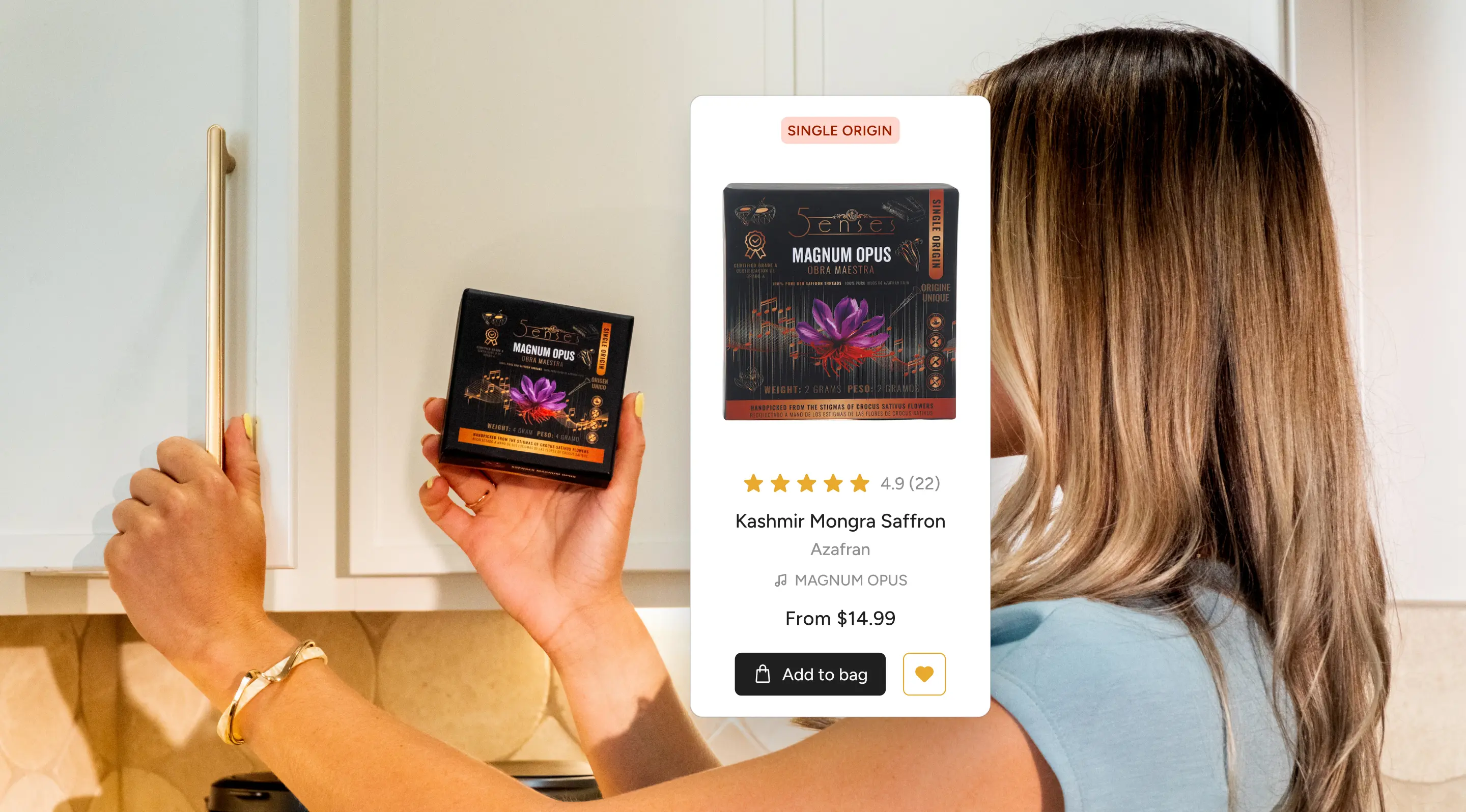
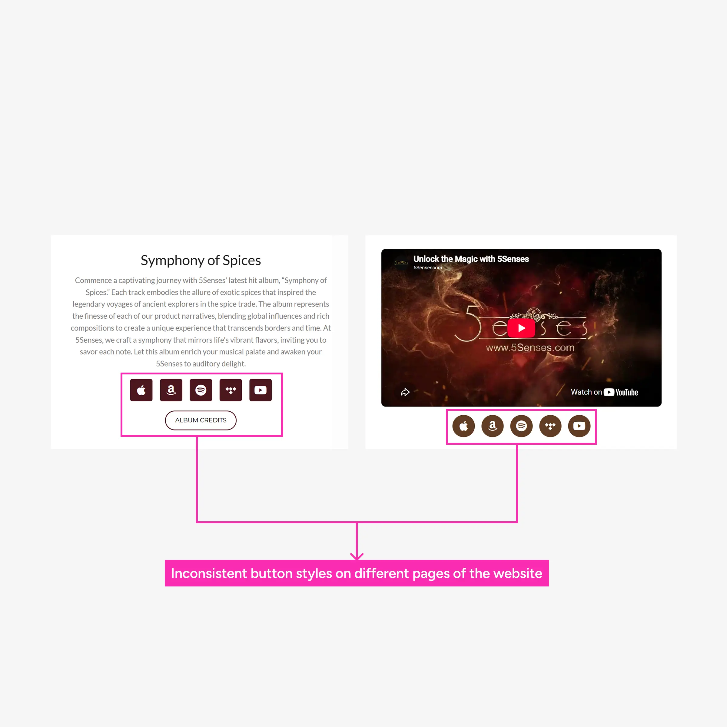
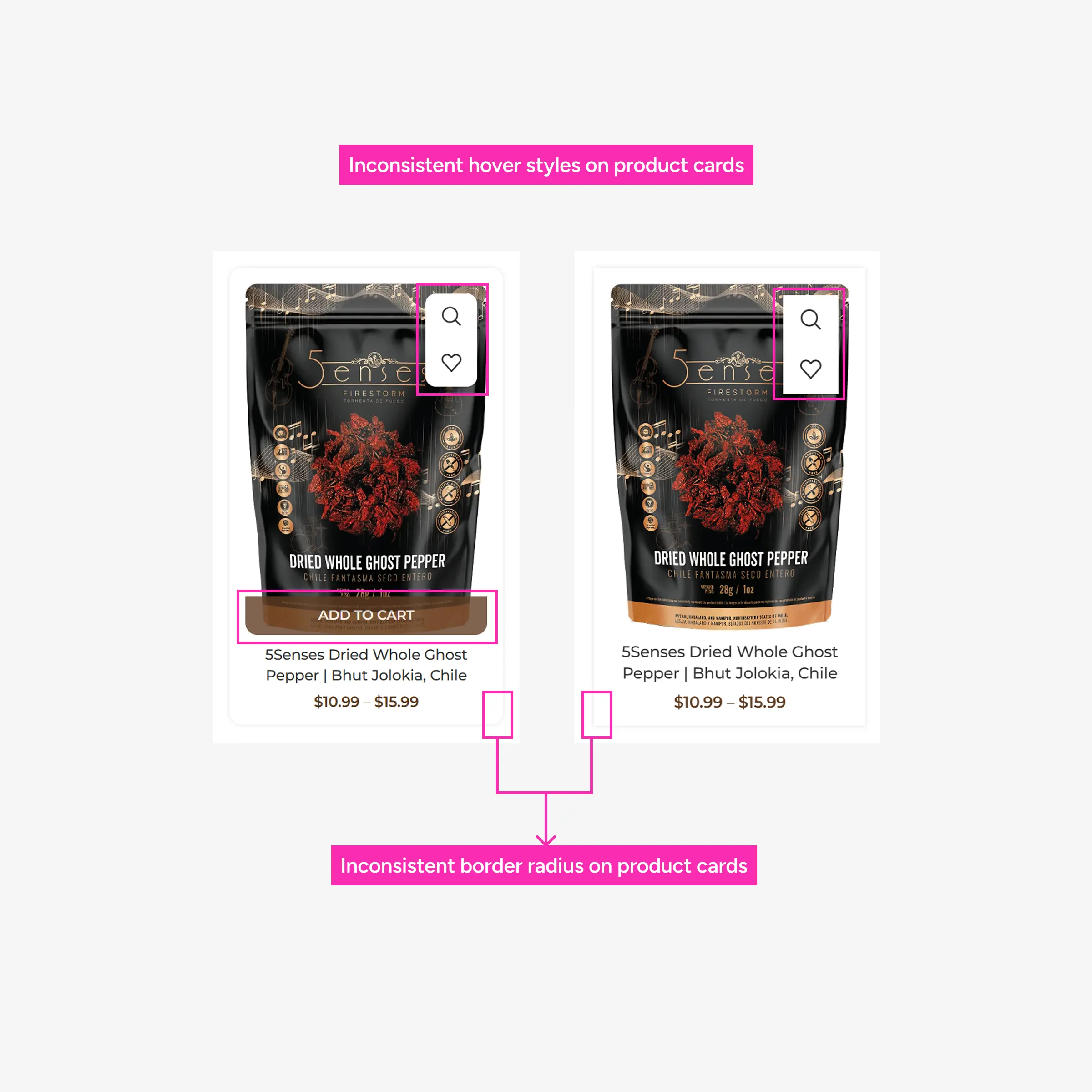
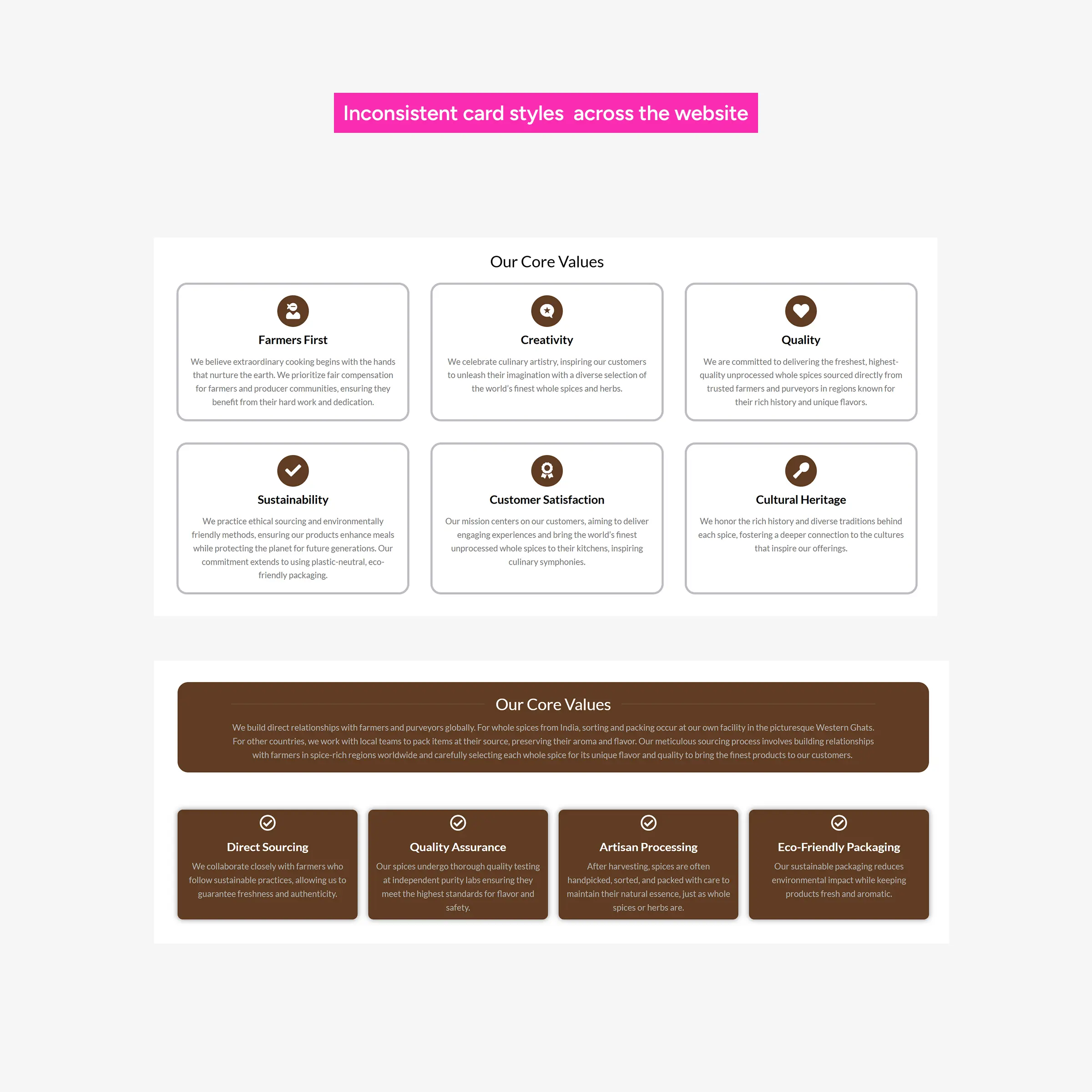
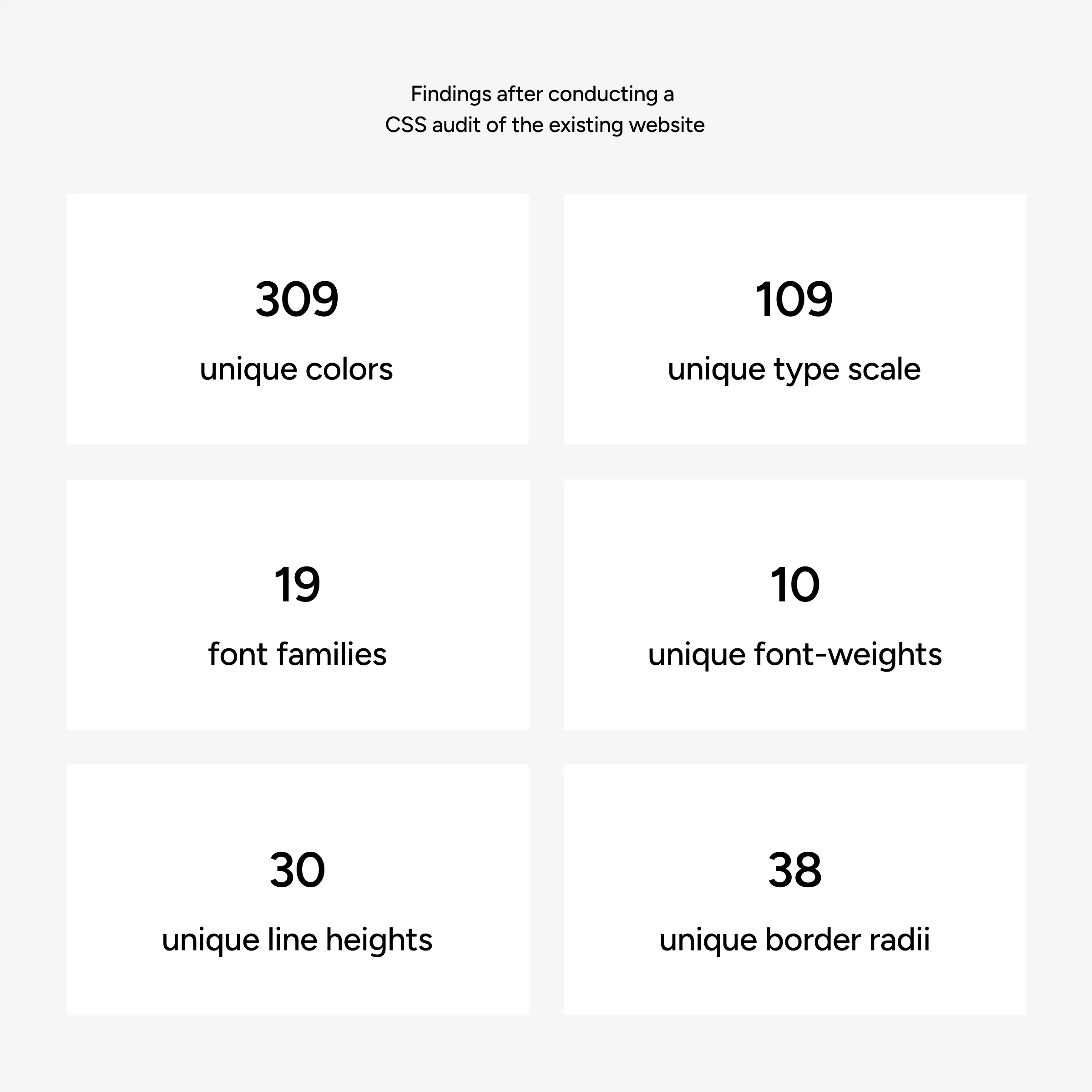
The existing website had many inconsistencies which made it difficult to maintain and scale
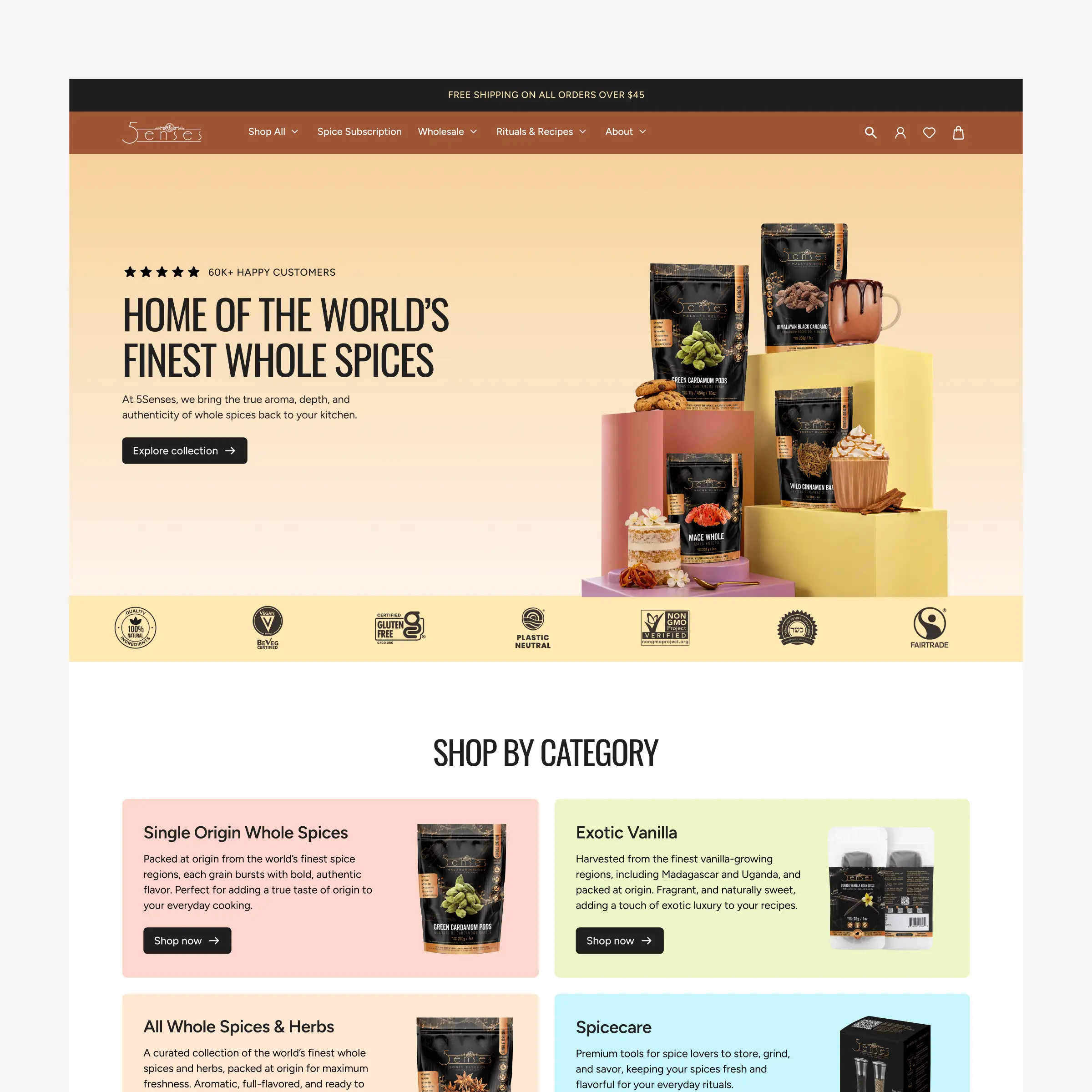
I joined the project as a designer and frontend developer in an existing team of developers, leading the redesign of 5Senses e-commerce website. The goal was to improve the shopping experience and establish the site as a stronger sales channel alongside the business’s Amazon Storefront and other third-party marketplaces.
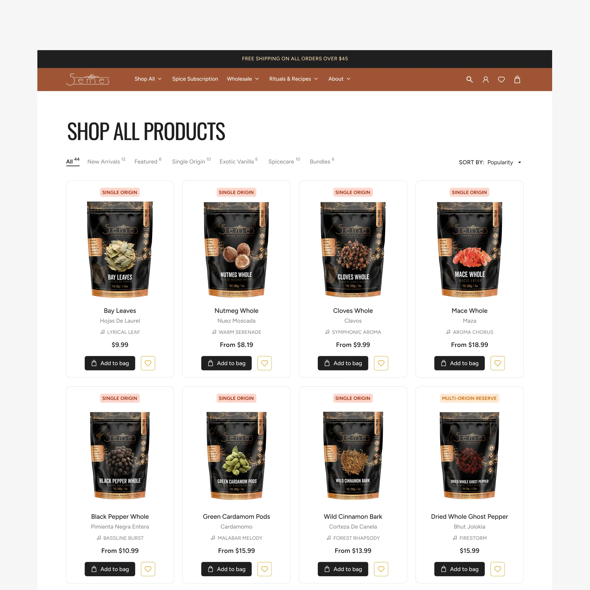
Auditing the existing site revealed inconsistent product layouts, imagery, and button styles, alongside slow performance that made the shopping experience feel frustrating. The business was also looking to significantly expand its product catalogue, so I saw this as an opportunity to create a more scalable foundation to support that growth.
Getting buy-in for the design system
The challenge with design systems is that they are infrastructure and require additional time without producing a visible deliverable. This made it hard to justify its value to the client. One of the obvious questions was whether it was worth investing the time when I was both the designer and the frontend developer.
To get the buy-in, I positioned it as an investment in the site's growth. I explained how a shared language between design and development would reduce repeated decisions during implementation and create a foundation that could support future growth of the website.
Creating the design system around the product
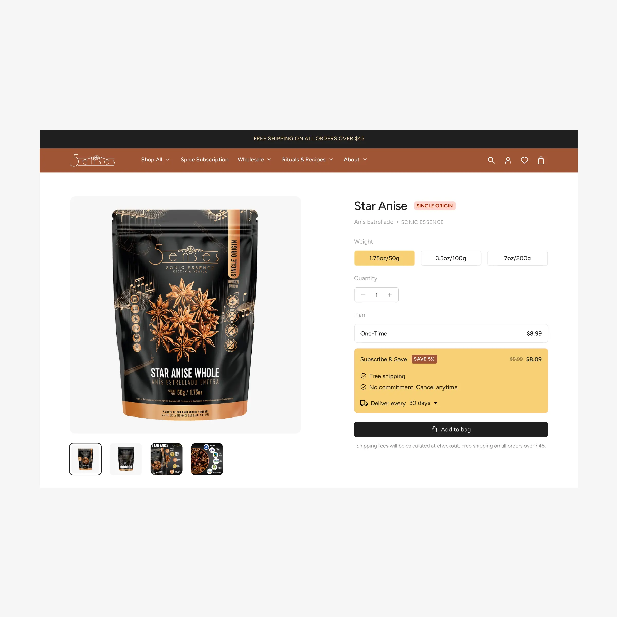
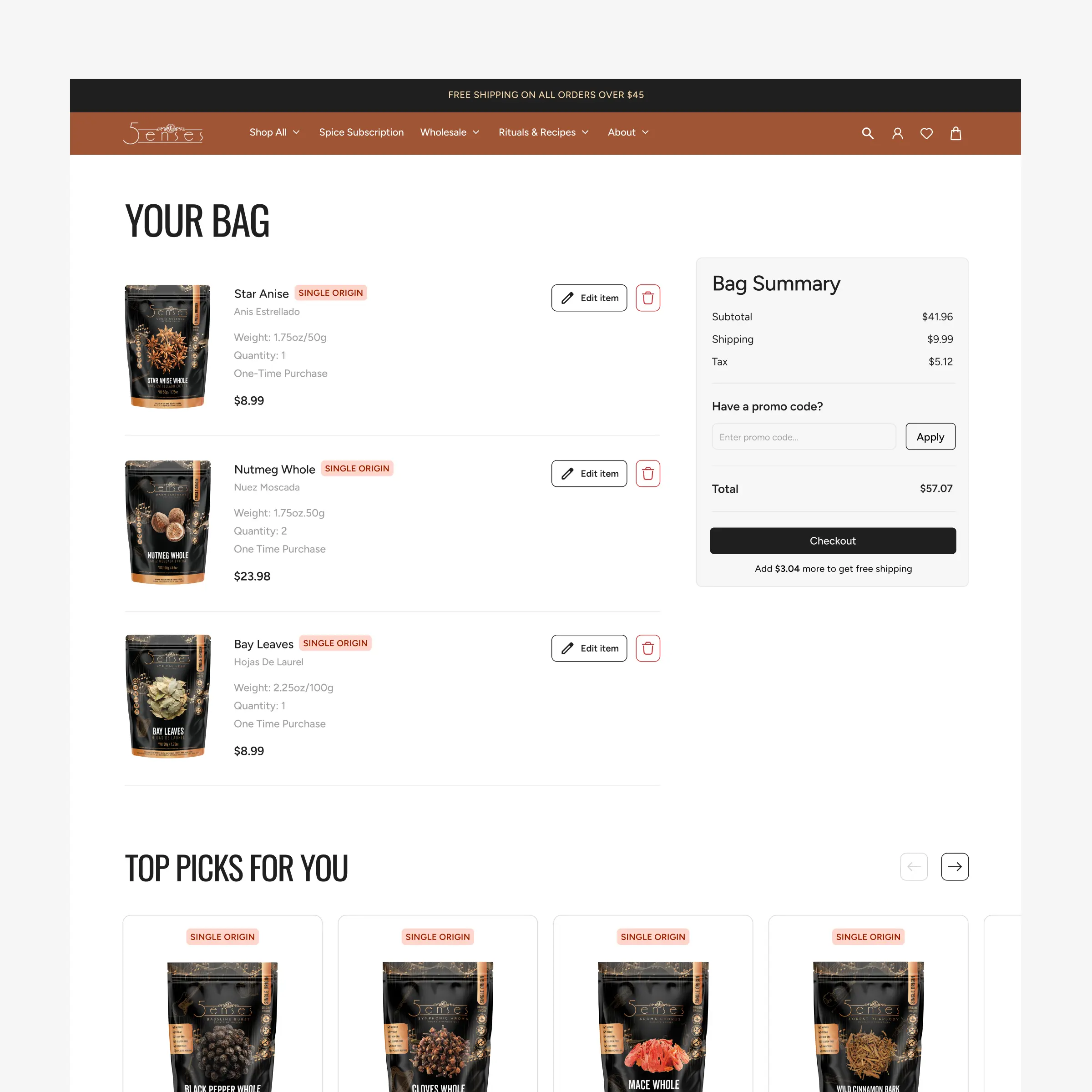
One of the biggest decisions that I had to make was deciding when to create the design system. I first focused on the core user journeys, working closely with the client to refine each page layout before building out the design system. This allowed me to iterate quickly based on feedback without worrying about whether every element already fit into a reusable component.
From there, I extracted recurring typography styles, colors, and elements to create a design system and component library. The result was a smaller, more focused design system built around the real product.
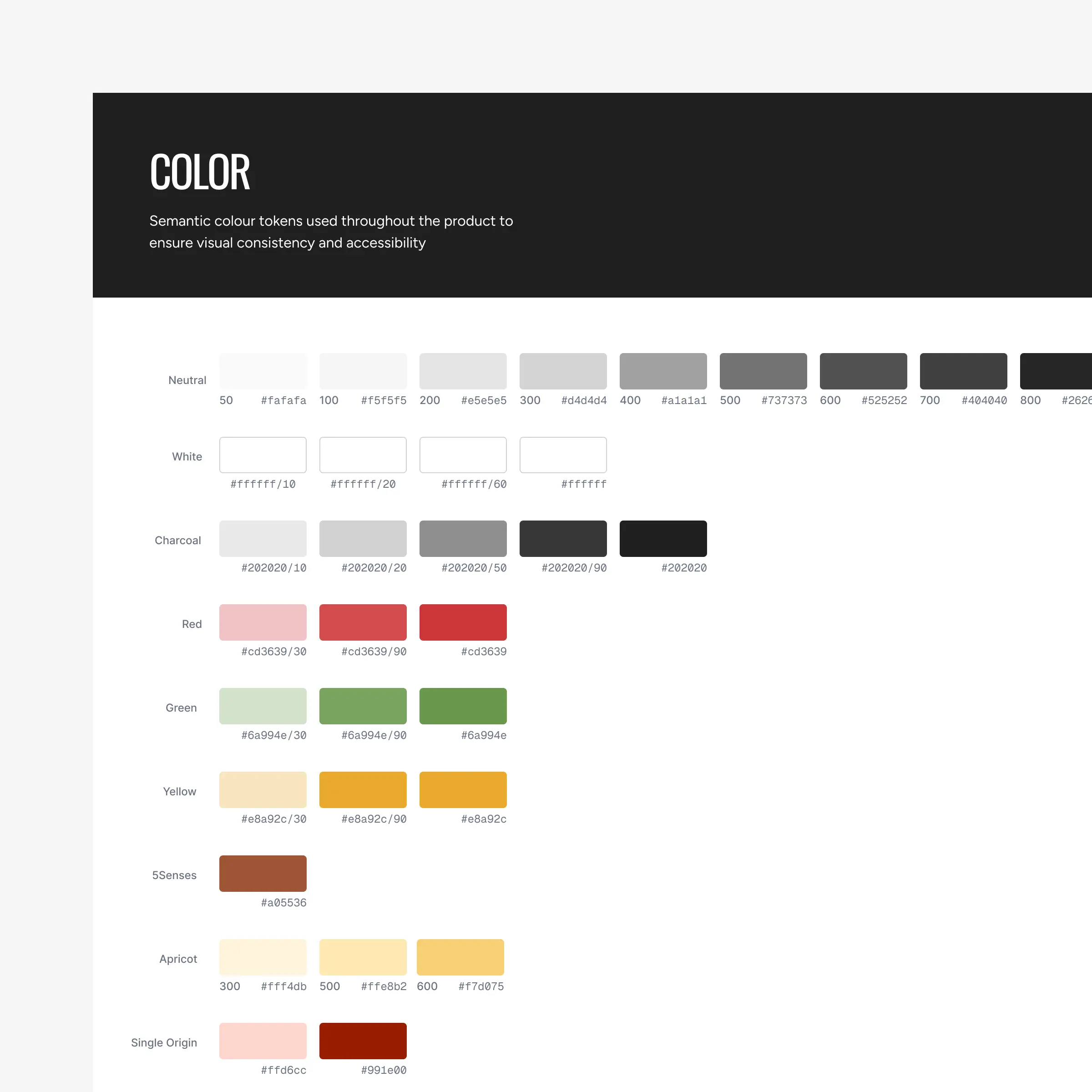
Raw color values to semantic tokens
Raw color values are translated into semantic tokens within the design system. Each value is mapped to a token that communicates its intended purpose and usage. This creates a clear connection between the design decisions and their implementation in code, while making the system easier to maintain and scale.
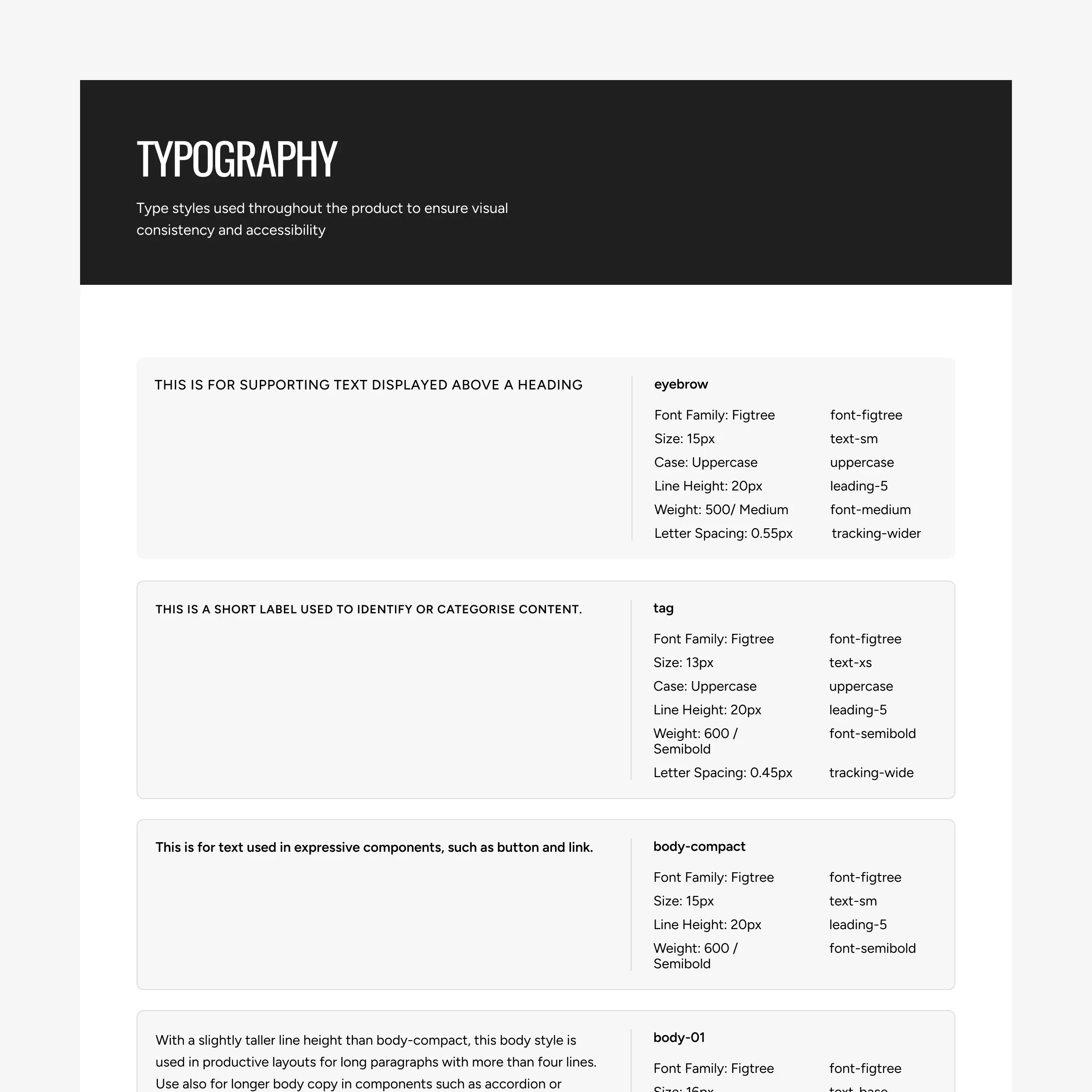
Setting up type styles
Typography system is structured as reusable type styles and mapped directly to their corresponding Tailwind classes. Each style brings together the relevant properties into a consistent, predictable pattern. This created a shared language between the design file and the codebase and a type system that is easy to scale and maintain.
Building a design system that translated naturally into code
The redesigned website was being built in Next.js and I was given the freedom to choose the approach for the UI layer.
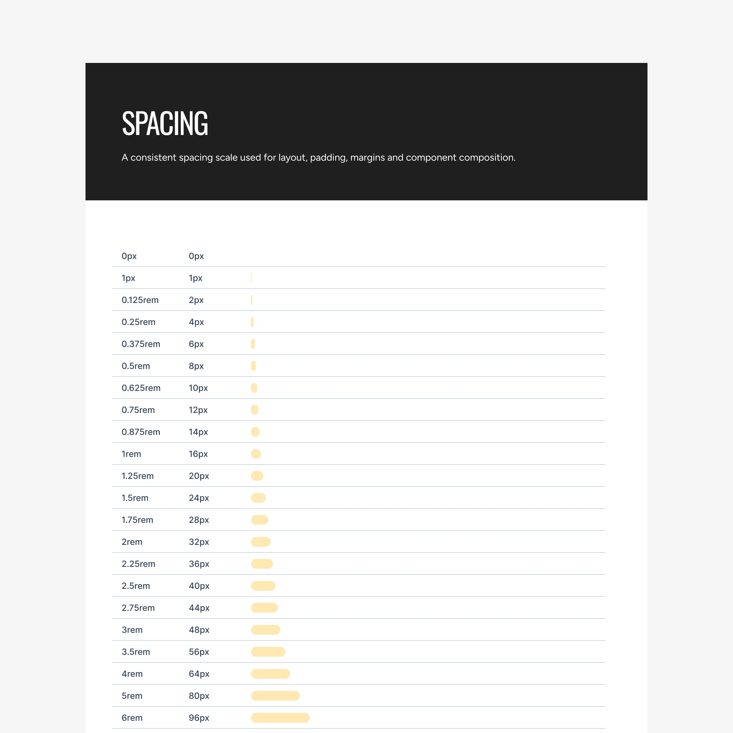
Having previously worked with Tailwind CSS and shadcn/ui, I was familiar with the benefits of using a consistent system of variables, semantic tokens, and reusable components. I used the same principles and created a set of foundations for colour, typography, spacing, and other recurring visual properties.
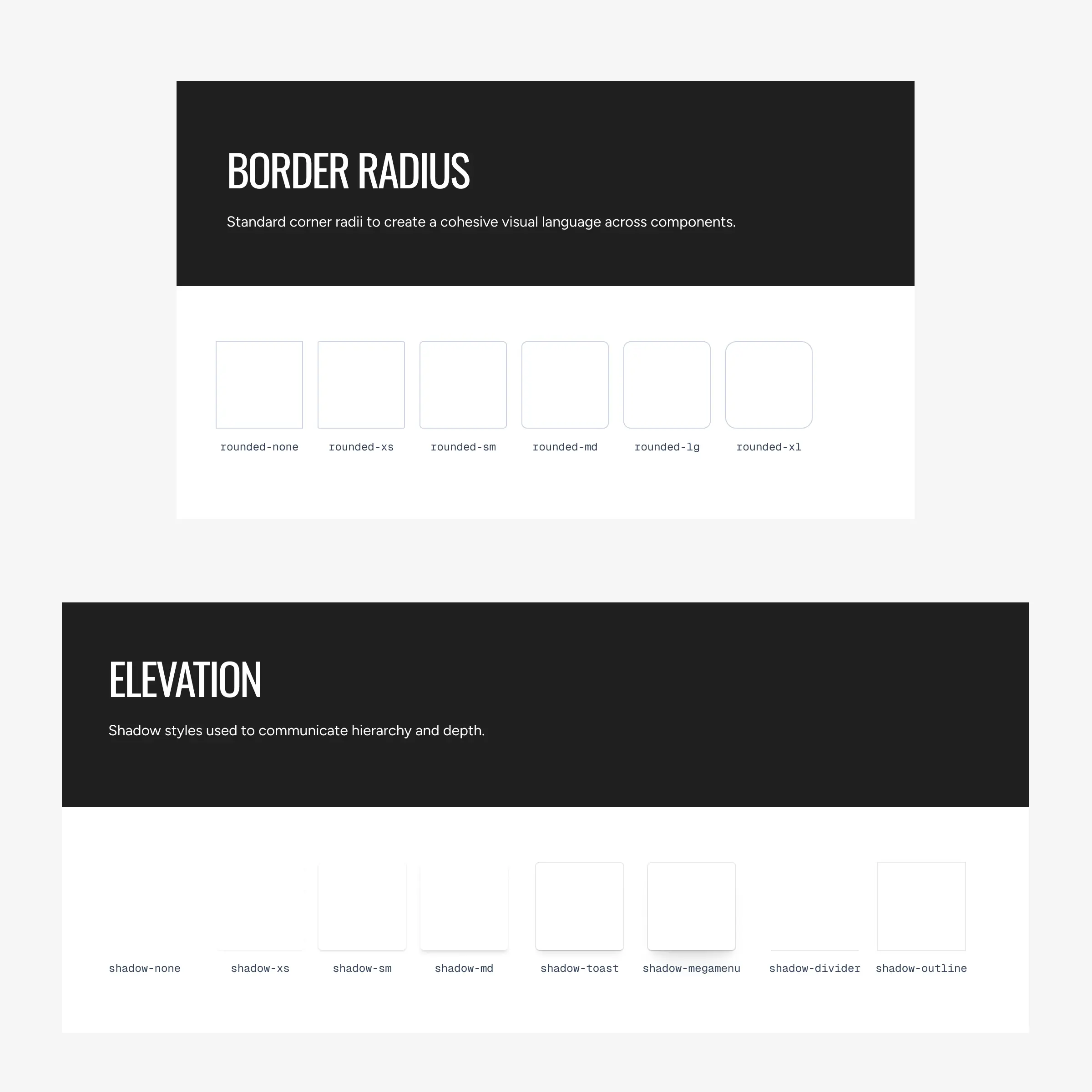
Choosing simplicity and resisting over-engineering
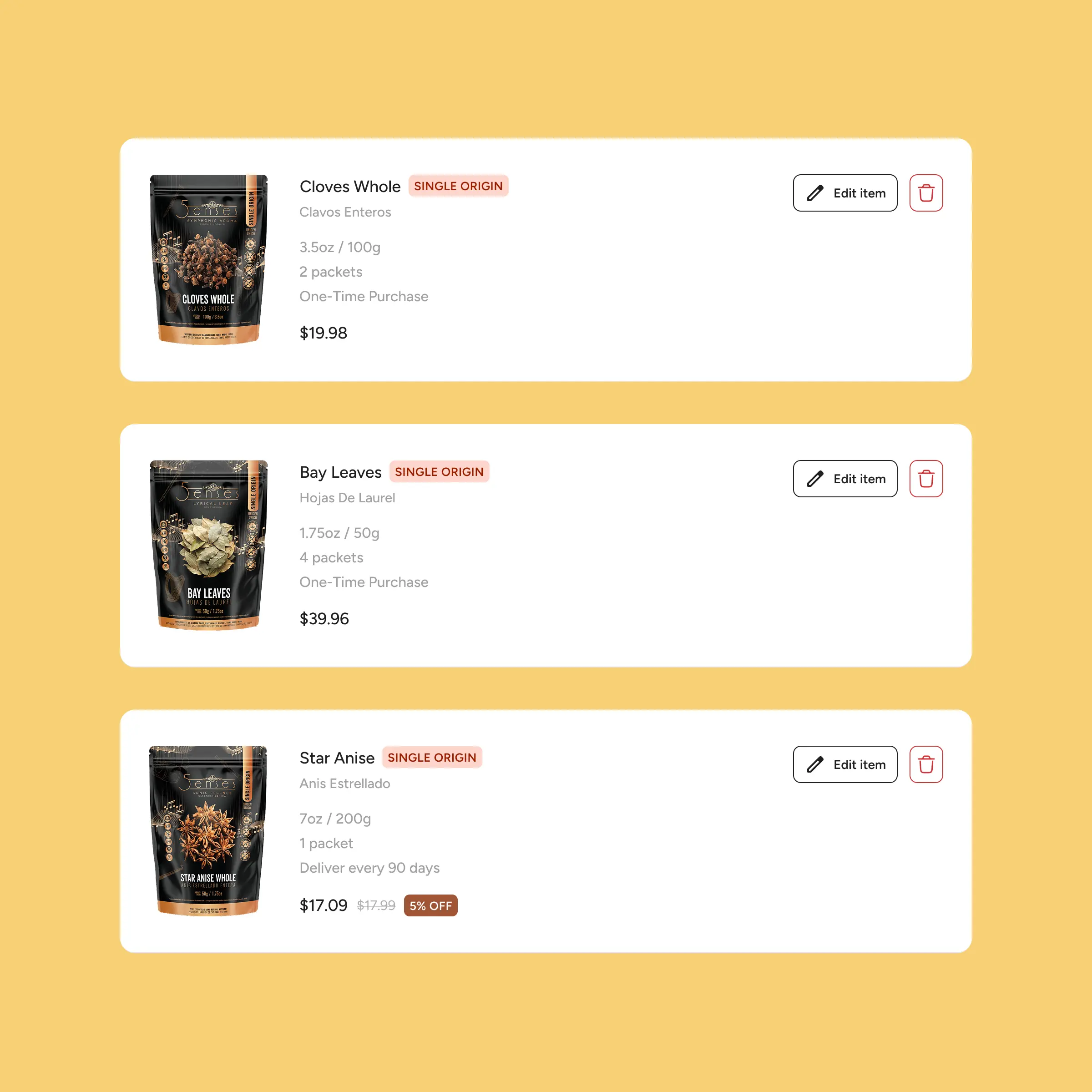
As a small team, we needed to move fast. I focused on building a lean, well-structured set of components that addressed our immediate needs while remaining flexible enough to evolve.
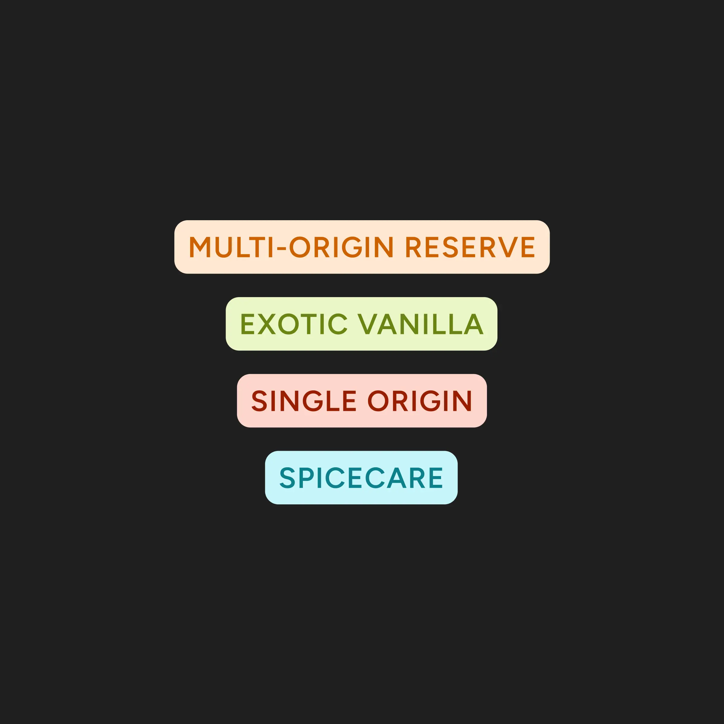
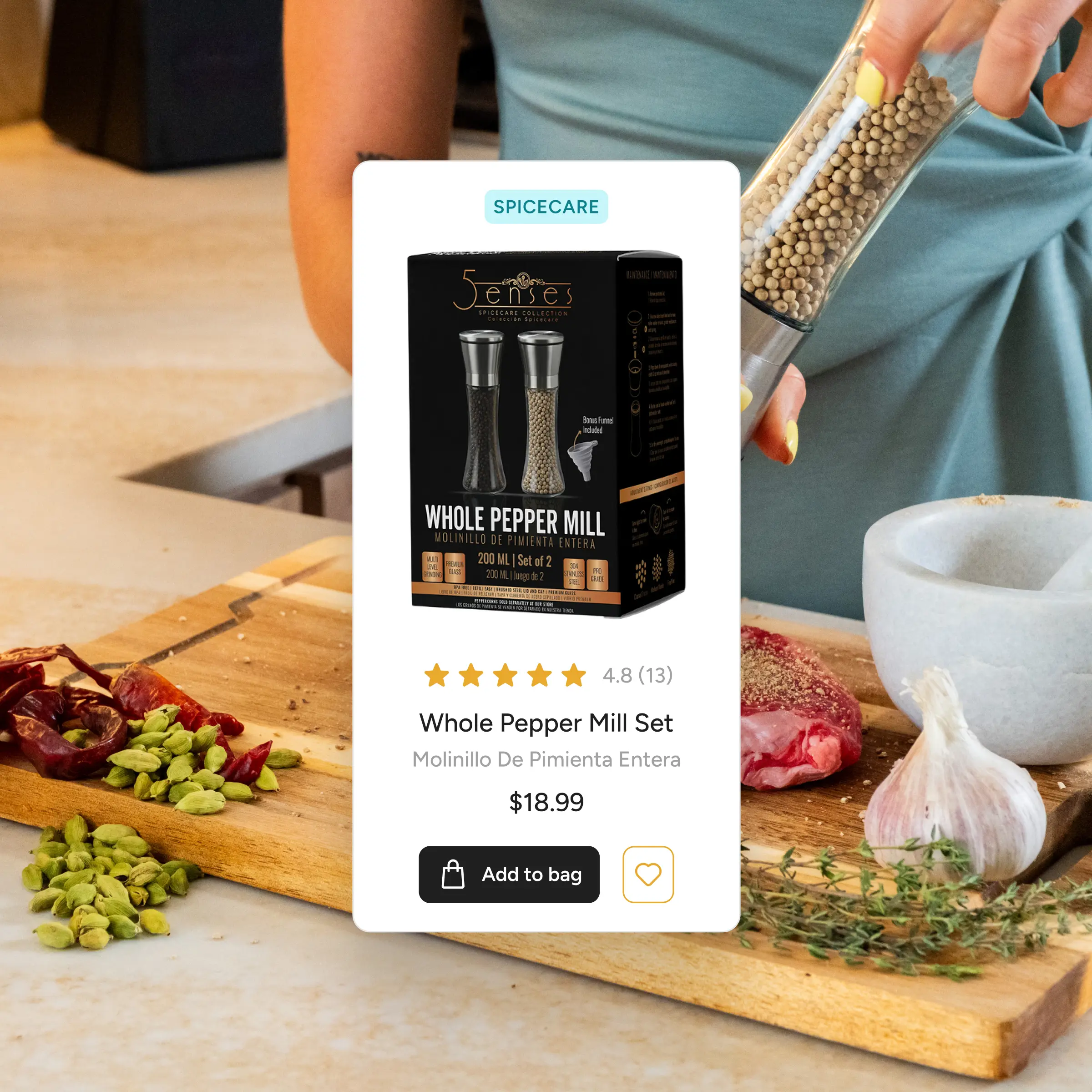
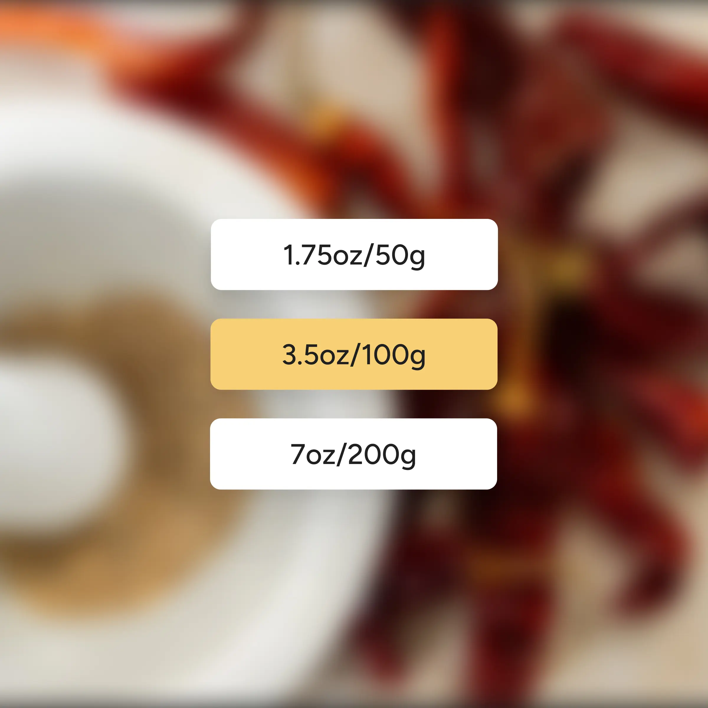
Each component was kept intentionally focused, with variants that covered the key patterns needed across the product. This reduced the need to solve the same UI problems repeatedly during development, making it easier to build, review, and make changes as the product evolved.
Collaborating with the developers for maximum value
Throughout the process, I collaborated closely with the lead developer to validate implementation decisions, discuss technical considerations, and ensure the design system aligned with how the product would be built, maintained, and scaled.
This significantly reduced ambiguity during the dev phase. Unexpectedly, this also benefited the developers. Because the design system established predictable rules, they were able to confidently build layouts for edge cases without having to make any new design decisions each time.
Things I learned from this project
Design system largely reduces ambiguity during development
Before this project, I largely associated design systems with consistency and reuse. Working across both design and frontend development changed that perspective. The real value was reducing ambiguity during the development phase, creating a shared language for how things should look and be built.
Build the design system along with the product
This project reinforced that design systems should evolve alongside the product rather than be treated as a one-off deliverable. By allowing recurring patterns to emerge before formalising them, the system stayed grounded in the product’s actual needs.
Invest more time into documentation
Because we were a small team moving fast, extensive documentation wasn’t necessary. But that also highlighted where the system would need to mature next. As more people use it, clear usage guidelines, component documentation and tools like Storybook become essential for making decisions understandable.